How to Automate Visual Regression Testing with Screenshots in 2026
Alex ChenJun 14, 20269 min read
Find out how easy it is to capture and share pixel-perfect screenshots at scale using Allscreenshots. Sign up for a free account and start integrating your first screenshot API call today.
AC
Alex Chen
Full-stack developer and technical writer who loves browser automation and making complex tools accessible.
Visual regression testing is the safety net for changes your unit tests cannot see. A route can pass every assertion and still ship with a broken hero, an invisible button, a clipped checkout form, or a mobile layout that only fails at one breakpoint.
The practical version is simple: capture screenshots for important pages, compare them against approved baselines, and review the differences before a release goes live. The hard part is making those screenshots stable enough that developers trust the signal.
This guide shows how to design that workflow with screenshot APIs, CI previews, and reviewable baselines.
What Visual Regression Testing Should Catch
Visual tests are not a replacement for functional tests. They are a different layer.
Use them to catch:
Broken responsive layouts
Missing images, icons, fonts, and background assets
Unexpected spacing changes after CSS refactors
Components hidden behind sticky headers or cookie banners
Theme regressions in dark mode or high-contrast views
Marketing pages that drift after CMS or dependency updates
Skip them for flows where the expected output changes on every run unless you can control the data. A stock ticker, live feed, random testimonial carousel, or personalized dashboard will produce noise until you freeze or hide dynamic regions.
Start with a Small Test Matrix
The fastest way to fail with visual regression testing is to screenshot everything on day one. Start with pages that are expensive to check manually and damaging when they break.
Page type
Why it belongs in the first pass
Homepage
High traffic, broad brand impact
Pricing
Revenue-critical and often edited
Signup or login
First-product impression
Checkout or upgrade
Direct conversion impact
Docs landing page
Navigation and trust signals
Core app dashboard
Dense UI with many layout states
For each page, choose a small viewport set:
Viewport
Size
Purpose
Mobile
390 x 844
Modern phone layout
Tablet
768 x 1024
Navigation and two-column transitions
Desktop
1440 x 900
Primary working viewport
Wide
1920 x 1080
Large-monitor layout issues
You can expand later. A focused suite that runs on every pull request is more useful than a massive suite nobody wants to maintain.
Make Screenshots Deterministic
Good visual regression testing starts before the screenshot comparison. If the capture is inconsistent, the diff will be inconsistent too.
Control the page state
Use predictable data in preview environments. Seed test accounts, lock feature flags, and avoid production APIs where content changes independently of the code being reviewed.
Disable motion
Animations and videos create false positives. Add a test stylesheet or query parameter that disables transitions:
*, *::before, *::after{animation-duration:0s!important;animation-delay:0s!important;transition-duration:0s!important;scroll-behavior: auto !important;}
Hide volatile regions
Timestamps, user avatars, ads, live chat widgets, and A/B test slots should not decide whether a pull request passes.
Prefer hiding a small volatile element over increasing the diff threshold for the whole image. Broad thresholds can hide real regressions.
Capture Screenshots Through an API
You can run Playwright or Puppeteer yourself, but CI browser infrastructure becomes another system to maintain. A screenshot API keeps the test runner focused on orchestration while the rendering service handles browser setup, full-page scrolling, ad blocking, and device settings.
For larger suites, use asynchronous screenshot jobs or bulk workflows so CI does not hold open one HTTP request per page.
Compare Against Baselines
Once screenshots are captured, compare them with a deterministic image diff library. Teams often use Pixelmatch, Resemble.js, Looks Same, or a hosted visual review service.
If you already run browser tests with Playwright, keep those tests focused on behavior and use screenshots for the visual layer. The combination is stronger than either tool alone.
Decide How Baselines Get Updated
Baseline updates need a review process. If anyone can overwrite the approved images automatically, the test loses value.
Use one of these patterns:
Pattern
Best for
Tradeoff
Manual baseline PR
Small teams and critical pages
Slower, but very clear
Main-branch refresh
Fast-moving product UI
Requires discipline in PR review
Release baseline
Marketing sites and docs
Fewer updates, larger diffs
A good rule: a baseline update should be reviewed by someone who understands the intended UI change, not just the person who changed the code.
Reduce False Positives
Most visual testing failures come from environmental noise, not actual bugs. Tighten the capture before you loosen the comparison.
Use the same viewport dimensions every time
Wait for a stable selector instead of a fixed sleep
Visual regression testing is part of CI, so monitor it like CI:
Metric
What it tells you
Failure rate
Whether the suite is noisy
Average capture time
Whether the matrix is getting too large
Baseline churn
Whether pages are too unstable
Reviewed diffs
Whether failures lead to useful decisions
Ignored failures
Whether the signal is losing trust
If developers routinely rerun the job until it passes, fix the capture setup before adding more pages.
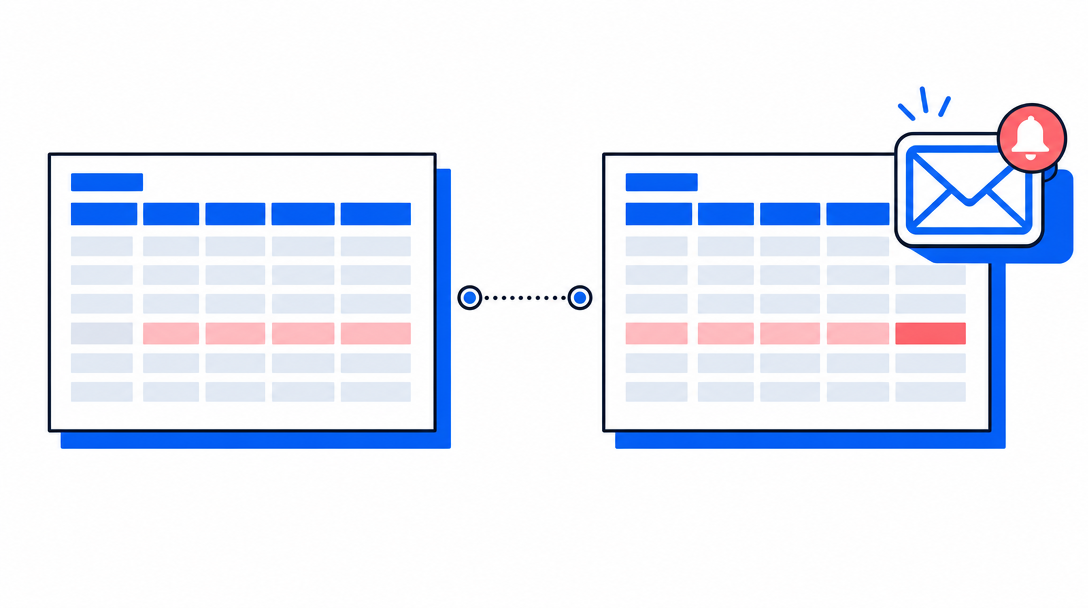
Where AllScreenshots Fits
AllScreenshots visual regression testing gives teams the screenshot capture layer without managing headless browsers in CI. It is especially useful when you need:
Automated visual regression testing works best when it is narrow, stable, and tied to real review decisions. Start with a handful of critical pages, capture them consistently, compare against approved baselines, and make visual diffs easy to inspect in pull requests.
The goal is not to block every pixel change. The goal is to catch the visual changes nobody intended to ship.