Replace your 'tell us about your company' form with a single field
Liina Tamm9 min read
Find out how easy it is to capture and share pixel-perfect screenshots at scale using Allscreenshots. Sign up for a free account and start integrating your first screenshot API call today.
The classic B2B onboarding form is ten questions long. Company name. Company website. Industry. Company size. Job title. What does your company do? Upload your logo. Primary brand color. Most of those answers already live on the user's website. We're just asking them to retype information they already published.
The pattern this post is about: collect the website URL first, derive everything else from it, then show the user what you found and let them edit. Fewer abandoned signups, friendlier first impression, and the rest of your product gets a richer profile to work with.
The pattern
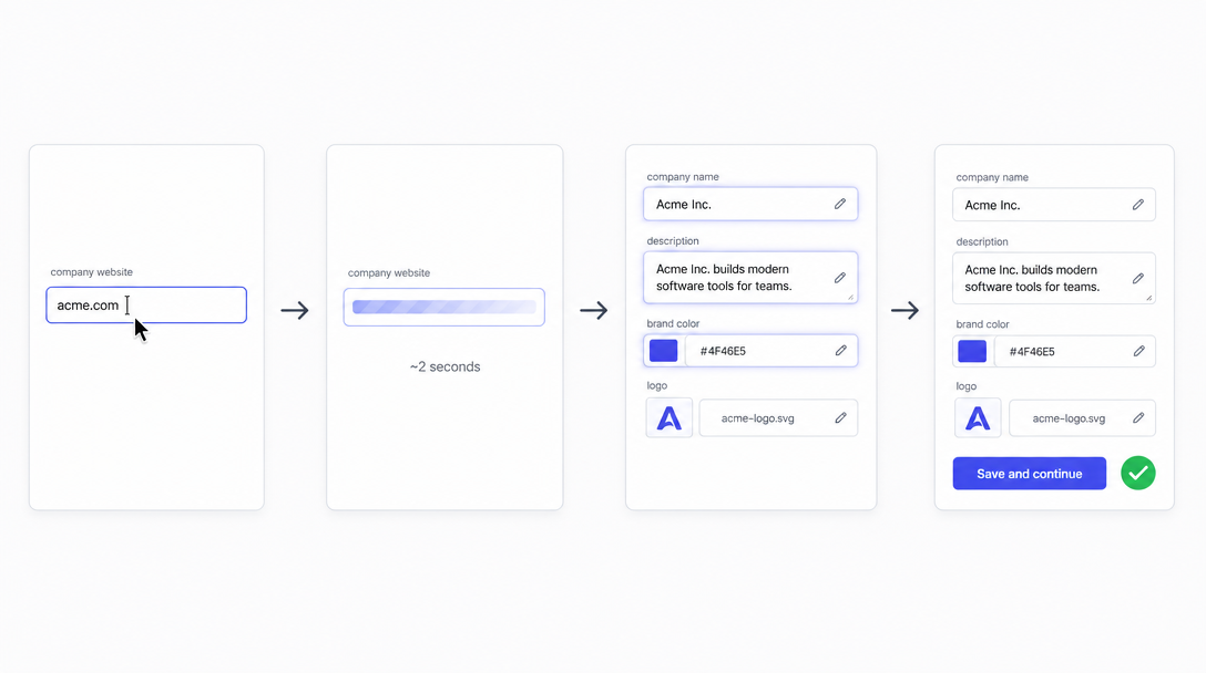
URL-first onboarding: one field, ~2 seconds of work, an editable pre-filled form.
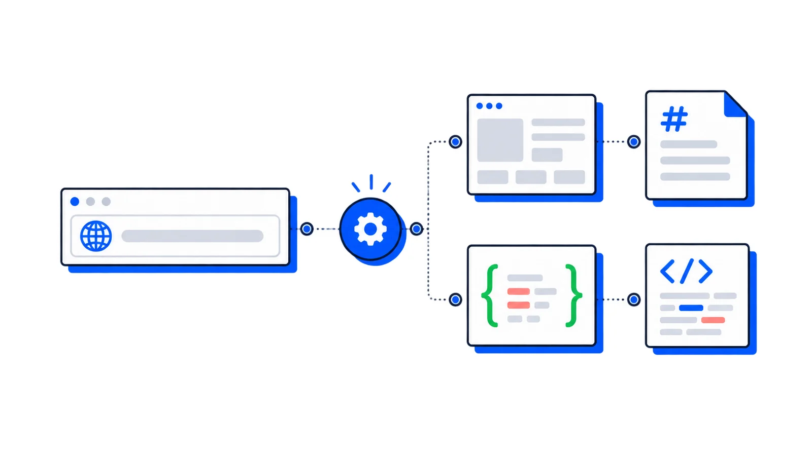
The "loading" step is real work. A browser visits the URL, renders the page, runs the extraction. With multi-output that's a single API call: the outputs array on POST /v1/screenshots returns a screenshot, the main content as markdown, and structured JSON in one round trip. On a real-world page that's about two seconds. Long enough that you should show progress, short enough that the user won't bail.
The rest of this post is what to put in that middle step in three different product contexts, plus the UX details that keep this from feeling like spooky autofill.
1. B2B SaaS signup
The setup: someone is creating an account. Step one used to ask for company name, website, size, industry, and a description. Replace those with just "What's your company website?"
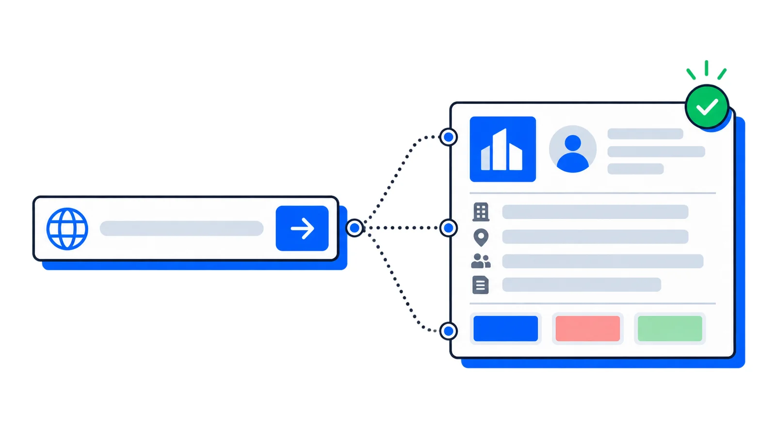
Use the JSON to pre-fill the form. Use the screenshot to show "this is the page we looked at" — showing the user what you grabbed is the single biggest trust unlock. And let people edit before anything saves (see UX pointers below).
What you didn't get from selectors (industry, a short company description) you ask an LLM for. The markdown and the screenshot are the inputs it needs. We cover that at the bottom of the post.
2. Sales tooling and CRM enrichment
The setup: a sales rep pastes a prospect's company URL into a contact card. Before, they'd manually fill in company name, industry, tagline, and any "what do they do?" notes — or wait on a third-party enrichment vendor.
Same call, slightly tuned schema. Sales tools care about a tagline and an industry hint:
The markdown is the LLM's input for "what does this company do, in one sentence, for our SDRs". The screenshot lands on the deal card as a visual anchor — reps spot a company faster from a screenshot of the homepage than from a logo and a name.
If you're processing leads in bulk (overnight CSV imports, list-enrichment jobs), swap the sync endpoint for async with a webhook and process the responses in your queue.
3. Email and newsletter platforms
The setup: a marketer creates a "Brand" or "Sender" inside your email tool. Today they upload a logo, pick a color, type their company name, write a short description, paste a footer. The whole first-template experience is gated on that setup.
If they paste their website URL instead, you can have the first template already look branded:
apple-touch-icon is usually the highest-resolution square logo a site exposes. Often a better fit for an email header than the OG image (which is wide and may be a marketing banner).
theme-color is what mobile browsers tint the status bar with — generally the brand's primary accent. It's not always a designer-approved palette, so show it as a suggestion the user can override.
Resolve favicon and apple-touch-icon as absolute URLs before storing — they often come back as relative paths.
UX pointers (what keeps this from feeling creepy)
A few details matter here.
Two seconds without feedback feels broken even when it isn't. Show a skeleton form filling in field-by-field, or a "looking at your homepage" message with the screenshot fading in. The wait has to feel intentional, not like the page hung.
Show the screenshot you pulled from. This is the biggest single trust unlock. When users see the page you actually looked at, the autofill stops feeling like a guess. And when you grabbed the wrong page (their /old-site, their staging URL, somebody's parking domain) they catch it before submitting weird data.
Let people edit every pre-filled field before anything saves, and never auto-submit. People paste the wrong URL all the time. Recovery should be one click.
Plan for nulls. Small or new sites won't have OG tags or theme colors. Skip those fields rather than leaving placeholder text the user has to delete. Fall back to the screenshot when there's no OG image.
One implementation detail: favicons and apple-touch-icon URLs come back exactly as written on the page, often as relative paths. Wrap them in new URL(href, requestedUrl).toString() before storing.
For the rest of the extraction-specific gotchas (h1 concatenation, missing fields), the multi-output guide has them.
Filling the fields a selector can't reach
Industry. Audience. A one-line description that isn't just the meta tag rephrased. Selectors can't get those. The screenshot and the markdown are what a vision-capable LLM needs to figure them out.
Pass both. The screenshot lets the LLM see the visual hierarchy and any text only rendered after hydration. The markdown gives it the textual context cheaply, with nav and footer already stripped by mainContentOnly: true.
Treat the LLM output the same way as the selector output: a draft the user can edit.
Where to go from here
This whole pattern runs on a single endpoint. If you want the technical deep-dive, the multi-output extraction guide walks through the request shape and the schema cookbook. For a wider look at what else you can build on top of multi-output (link previews, competitor snapshots, lead enrichment), see one call, screenshot + markdown + structured JSON.
The shortest signup form is just the URL field. Worth the day it takes to ship.
 Guide
Guide Guide
Guide